Distress palette distress!

Well, I thought I had it covered… I took my distress ink palette with me on holiday, intending to do some distress water colouring while I was away. I popped it in a bag with a piece of kitchen towel, sealed it up, placed in flat in a box, flat in the car boot and off we went. It seems that somewhere along the 4 hour drive to Holyhead, the ferry crossing to Ireland and 1.5 hours driving in Ireland there was sufficient rock and roll to slosh things about a bit:

Needless to say, I didn’t get any water colour done with this palette – I had to use my distress markers instead. I decided not to waste the lovely colours and used an adaptation of my paper towel printing technique to produce lots of lovely coloured napkins for backgrounds and decoupage:

I have several plies of the oranges, the blues and the greens ready for my collages and bits and bobs. After I’d rescued and used what I could, I set to washing up the mess and replacing the colour swatches on the lid. As you’d expect, all the inks rinsed off the plastic leaving no residues, unlike the stickers which left their adhesive behind – no matter, it just helps the next ones stick more! A couple of hours later, and my palette is restored:

A happy accident? Time will tell as I use up the various bits of kitchen paper I used to blot up the  mess in my artwork – watch this space! I would also like to find a thin sheet of silicone/rubber to seal the palette for the next trip – or thin one inch rubber washers to stick onto the lid. The palette is great, both in construction and price – but it sooo isn’t water tight! I’ve also learnt to only use half a dropper full of ink in each well rather than the full one I did first time round!


New Summer Distress Inks – Perfect Splatter Distress

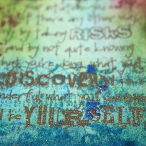
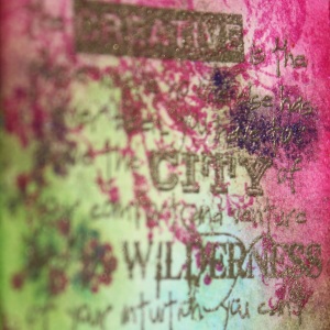
I snuck a few minutes in the craft room this morning to tidy up, and managed to play with my new Summer Distress Inks from Ranger. They are really bright hues, reminiscent of Dyan Reaveley’s colour palette, but as with all the other distress ink seasonal ranges, they play nicely together. I combined them with Perfect Pearls from the Jewels kit and the perfect splatter technique I learnt in Creative Chemistry 101 to make this tag. The embossing is Metallic Gold Rich Super Fine from WOW! Embossing Powders.

Mixed Media – Exhibition Piece

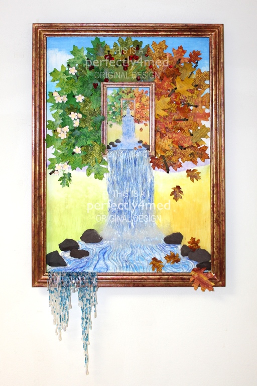
It’s been a while again since I’ve posted – I’ve been busy finishing off end of year projects at college, culminating in our exhibition last night. Here’s just one of my pieces (I’ll share some more in a couple of days), for the final mixed media module, inspired by the work of Jacek Yerka, my ‘chosen’ artist for this term.

Continue reading

Twelve Tags of 2012 – July and August

I have been creating, honest! I just can’t share some of what I have been doing due to commercial sensitivities, but as soon as I can, I will… and some of my creativity is on projects that are taking just that little bit longer to complete.

But I can share these two tags that I have done for this month’s Manic Stamper Craft Club, continuing my series of Twelve Tags for 2012. The first features triple embossing and a smidge of the frosted window technique for the ripples, as well as paper crafted water lilies. The second is napkin decoupage with a stamped and coloured image artfully placed on top. Fuller instructions will follow on the Manic Stamper blog once term has finished!

Drypoint print – the gallery editions

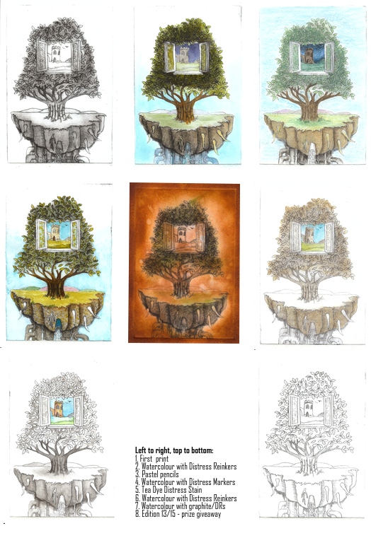
As I mentioned in my original post, I planned to further work on my drypoint prints, adding tone and colour. Here is a gallery of the results – and the bottom right is the print I have given away, number 13 of 15 – and may be the winner will want colour added? Most of these are now mounted for the end of term exhibition. There are some other prints available to purchase if you’d be interested…

I think some work better than others – I’m not happy with the tea dye one, it’s too dark. I am happy with the greyscale/monotone trees with the colour window. The pastel is very much in keeping with Jacek Yerka’s work on which this is loosely based as he prepares his paintings with a pastel version first. Let me know what you think 🙂

Take three stamps…

Take three stamps, add a little bit of colour magic and hey presto, another challenge entry! Well two, I couldn’t make up my mind which I liked best… It’s one layer week at ‘Less is More’ and the stipulation was to use three stamps, not two, not four, three. There’s precise for you!

Hero Arts Long Writing Background (F2674) in Frayed Burlap DI
Impression Obsession Textured Evening Gown (D4320) in Sepia Archival
Sentiment from WOW! Everyday Sentiments Clear Stamp Set in Jet Black Archival

-=-

Inkadinkadoo Arrange A Bottle Cling Set
WOW! Everyday Sentiments Clear Stamp Set stamped in Jet Black Archival

Bottles: Manganese Blue Archival, shading with Tumbled Glass Distress Marker
Flower: Tea Dye, Walnut Stain, Peeled Paint and Worn Lipstick Distress Markers

Dabber Resist Mixed Media Canvas

One of the techniques taught in the Creative Chemistry 101 class with ‘Professor’ Holtz was a dabber resist – taking advantage of the fact that acrylic paint is waterproof when dry. Here’s a canvas I put together over the bank holiday weekend making use of the technique, and how I did it follow after.

Continue reading

Three Shades of Green with a drop of yellow

It’s ‘Less is More’ challenge time again – and this week I’m a little earlier than I have been for the last couple of times! The first week of the month theme is colour, and they’ve set the task of creating a clean and simple card with three shades of green. I used the Hero Arts ferns set of stamps, and Shabby Shutters, Peeled Paint and Forest Moss Distress Inks. A spritz of water, punched flowers and a few drops of liquid pearls and here’s my entry:

Twelve Tags for 2012 – May


I’ve just finished designing my fifth tag in my Twelve Tags for 2012 series. This one features a distress stain background using techniques I learnt on my recent Tim Holtz’s Creative Chemistry 101 course, as well as air dry clay Lily of the Valley flowers. I love it when a plan comes together – I couldn’t find a stamp that I liked enough, so this was Plan B and I am rather pleased with the outcome, even if I do say so myself! I’ll be demonstrating how to make it and an accompanying card at the Manic Stamper Craft Club on 21st April. Instructions on how to make the tag are now available here.