Birth announcement

Oh, don’t for a moment think that I’ve kept something quiet for the last nine months! It’s ‘a baby is born’ as the theme for this month over at The Crafting Cafe and this is my design team contribution to the blog. Pop over for more instructions and information on the digistamp I used from Bugaboo Stamps.


So grateful summer’s here…

Though everything was a month late at the allotment this year, I did actually have blossom on the fruit trees, unlike last year, and some fruit has set. Unfortunately, the cherry tree is still having problems and I have just one cherry ripening. Not so on this card for The Crafting Cafe, featuring LEJ Designs ‘Blossom’ digistamp:


For more details on how I made the card, check out my post over at The Crafting Cafe.

Playing with ProMarkers

It’s been quite a while since I had chance to enter any web challenges, and since planning workshops is going fairly well, I decided to use time today to put that right. I’ve got out my ProMarkers again, and created two cards:

For you...The first is for the ‘Less is More’ one layer challenge this week, which requires that I use a ‘not square or rectangular’ card. I used string theory to draw out an ellipse template and transferred this to a card made from my favourite white coated cardstock (from Rymans) before stamping the image [docrafts] using Memento Tuxedo Black. I coloured the bears with Blush, Saffron, Ginger and Cinnamon, with Meadow Green/Apple and Pastel Pink/Salmon Pink for the roses.

Picnic timeThe second is for the ‘Passion for ProMarkers’ weekly challenge, which this time set the task of ‘set the scene’. I stamped the background image [Hobby Art – Countryside Scene] in Archival Jet Black onto watercolour paper before using AquaMarkers in Frost Blue/Perwinkle, Celery/Spring Green/Fern Green and Viridian with Granite and a waterbrush pen to colour. The picnic blanket was drawn freehand and coloured with ProMarkers – Warm Greys 1-4 over Lipstick Red. The girl is a stamp from Bild Malarna ‘Mimosa – Wonderful Day’ and complements the scene beautifully – she is stamped with Memento Tuxedo Black and coloured with ProMarkers: Pastel Yellow/ Sunflower/Gold and Caramel and Lavender/Orchid/Amethyst and skin tones blending Blush/Oatmeal and Apricot.

Blue Hues in a Can

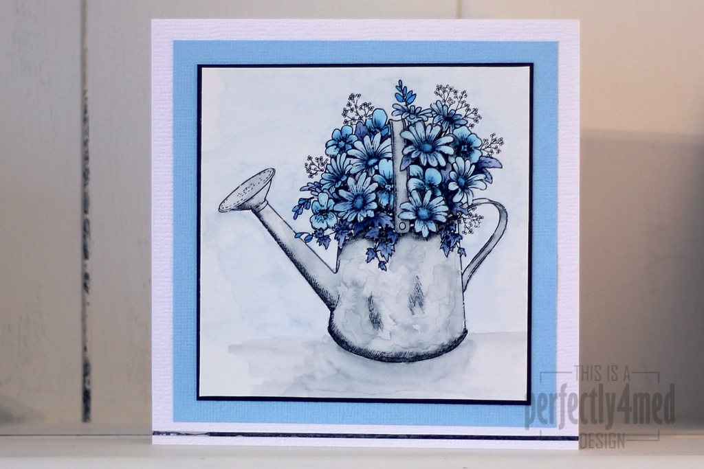
It’s a ‘Favourite Colour’ theme over at The Crafting Cafe, and I decided my favourite colour this month is blue, and used the fabulous Floral Watering Can from their sponsor Delicious Doodles for my base image. I recently fell in love with Letraset AquaMarkers, bought the entire set, and played with them some more for this card.

I started by printing two copies of the image onto 90gsm watercolour paper using my laser B&W printer. I added AquaMarkers to the crosshatched areas of the design (as these will be the darkest) and dragged the colour across the rest of the space with a waterbrush pen. I added extra layers of colour where needed by allowing the first layers to dry before painting on colour picked up from a palette (draw on a plastic sheet with the AquaMarker). That’s how I built up the mottled watercolour effect on the can and the shadow.

For added depth (not easily seen on the pic) I coloured in the second copy and cut out selected items, edged them in black and layered them decoupage stye onto the flowers. Try to choose things that aren’t overlapped by anything else and you’ll get the foreground elements perfectly.

Pens used:
Can – Pebble Grey
Flowers – Deep Sapphire/Storm Blue/Vintage Blue/Mediterranean
Background – Pebble Grey/Frost Blue

Mounted on black card over Bazzil on 14x14cm ‘linen’ style card. The metallic strip at the bottom is by Letraset and helps ground the image.

Let me know if you’d like a more in-depth/video tutorial on using AquaMarkers. I think they’re fab!


Tulip Cards

I’m on another design team! Early in January I was selected to design for ‘The Crafting Cafe’, and they have just launched their challenge blog. For the ‘anything goes’ theme this month, I’ve used the fabulous ‘Tulips 1’ digi stamp from LEJ Designs. I’ve created two cards, the first using ProMarkers to colour, and the second with Distress Reinkers both on a bespoke background created with Distress Stain and kitchen salt:

Continue reading

Twelve Tags of 2012 – September

I’ve been playing with various options of putting colour onto metal – here are the results! I’ll be showing how to do them at the Manic Stamper Craft Club on Saturday.

The tags are first covered with metal foil tape (really thin foil – serves me right for going to the local poundstore!) and then I used a small embossing ball tool to emboss the outlines. Rub over the whole tag with black acrylic paint, and then wait for it to almost dry before rubbing off the paint from the tag – it should catch in the outlines. Add colour with acrylic inks (I used a paintbrush), Promarkers or alcohol inks (I used the Adirondack alcohol ink pen filled with blending solution to pick up dried alcohol inks from a palette). I love the aged look to the metal caused by the black acrylic, and the translucent colour from the Promarkers/alcohol inks. The acrylic inks are more luminous due to their opacity. By the way, alcohol seems to denature acrylic, so if your black coating doesn’t work out, wipe over with alcohol hand gel and try again!

And as a bonus, I’m publishing the forget-me-not doodle as a tangle pattern 🙂

Which watercolour effect?

I’ve been playing with various watercolour effects, out of curiosity more than any thing! Thought I’d share the results, just in case someone else might be interested… All of them feature a Stampendous stamp (Cling Poppy Scene #CRM234).

Continue reading

How charming… cut it out!

I’ve combined two challenges again for this morning’s experimentation… ‘Less is More’ this week set ‘How Charming’ and asked us to include a charm on our project, while over at ‘Passion for Promarkers’ we were told to ‘cut it out’ using our die cutting skills. So here’s my combined entry:

Continue reading

Spring { petals }

It’s Lucky Dip time over at the ‘Less is More’ challenge, and this time they have set a colour theme based on one of the fabulous Design Seeds schemes:

I decided to make my card with ProMarkers again this time, and picked the closest matches in colour: Cool Grey 2, Grey Green, Meadow Green, Blossom and Rose Pink. Here are three cards that I stamped and coloured using the set colour scheme:

More butterflies – and the odd moth

I’ve had a creative day today – and this is one of the results. I’ve used the new Attic Treasures stamp from Tim Holtz, masking tape, Promarkers and a Letrajet attachment, a bit of Letraset metallic tape and a few stick on pearls. I’ve kept it clean and simple to enter the ‘Less is More’ masking challenge this week, and the colour scheme fits the ‘Passion for Promarkers’ yellow and pearls challenge. Oh, and me being me, I looked up each of the winged things on the interweb to find out what colours they should be…

I’m thrilled to be showcased over on the Less is More blog for this card – what an honour to be the first LIMister!